How to Write in Cursive: A Complete A–Z Guide for Beginners
Cursive always looks harder than it is. The letters flow into each other, the pen barely lifts, and somehow experienced writers produce something that looks almost like art. But the mechanics behind it are straightforward once you know what order to learn things in and which letters to start with.
If you want to learn how to write in cursive, you’re in the right place. This guide covers every lowercase letter, every capital that people search for most, how to write your name, how to write common phrases like “Happy Birthday” and “I love you,” and how to write numbers. Whether you’re starting from zero, relearning as an adult, or looking to learn to write in cursive alongside a child, this is the full picture.
To write in cursive, start with basic upstroke motions, then learn lowercase letters grouped by stroke type (not alphabetically). Connect letters by flowing the exit stroke of one letter directly into the entrance stroke of the next. How do you write in cursive from A to Z? Work through the four stroke groups in this guide, practice 15–20 minutes daily, and you’ll have legible cursive within a few weeks.
Table of Contents
What Is Cursive Writing?
Cursive is a style of handwriting where letters connect to each other in a continuous, flowing motion. Instead of lifting your pen between every letter like you do with print, the pen moves from one letter to the next in a single stroke or with minimal lifts.
The word cursive comes from the Latin cursivus, meaning “running.” That’s a good mental image. The pen runs across the page.
| Feature | Print (Manuscript) | Cursive |
| Letter connection | Letters stand alone | Letters connect within words |
| Pen lifts | Between every letter | Minimal, mostly within complex letters |
| Writing speed | Slower | Faster once practiced |
| Letter formation | Closer to typed fonts | Flowing, slanted strokes |
| Difficulty to start | Easier | Moderate |
| Fine motor demands | Low | Medium to high |
Cursive is sometimes called longhand, script, or joined-up writing. In schools across the US, India, and Pakistan, it’s taught as standard written English.
Why Learn Cursive?
You don’t need a long list of reasons, but here are the real ones that matter.
Writing in cursive is faster than print once you’ve built the muscle memory. Your hand doesn’t stop and restart between letters, so the motion becomes fluid and quick. For students taking notes by hand, that’s a genuine advantage.
Research from neuroscientist Prof. Karin James at Indiana University found that handwriting activates brain networks that typing doesn’t. Cursive specifically, because of its connected motion, engages both hemispheres of the brain simultaneously. Studies also link cursive practice to improved reading ability and information retention.
For learners with dyslexia or dysgraphia, cursive can actually be easier than print. Because letters connect, it reduces the visual breaks between characters that often cause confusion.
And beyond the practical stuff, there’s a personal reason: your cursive becomes uniquely yours. Nobody else looks exactly like it.
What You Need Before You Start
You don’t need much. The basics:
Paper: Use lined paper with three lines if you can find it (baseline, midline, and top line). Wide-ruled notebook paper works fine. The lines keep your letters consistent in height while you’re learning.
Pen: A ballpoint or gel pen flows more smoothly than a pencil for beginners. That said, a pencil lets you erase, so it’s a reasonable choice when you’re still forming letters. Avoid very thin tips; medium point gives you more control.
Posture: Sit up straight with your feet flat on the floor. Rest your forearm on the desk, not just your wrist. Your arm should be able to glide a little as you write across the page.
Paper angle: Tilt your paper about 30–45 degrees. For right-handers, the top of the paper angles to the left. For left-handers, angle it to the right. This lets your hand move naturally with the slant of cursive letters.
The Key Concept: Basic Strokes First
Before jumping to letters, spend 5–10 minutes practicing three fundamental movements. Everything in cursive comes from these.
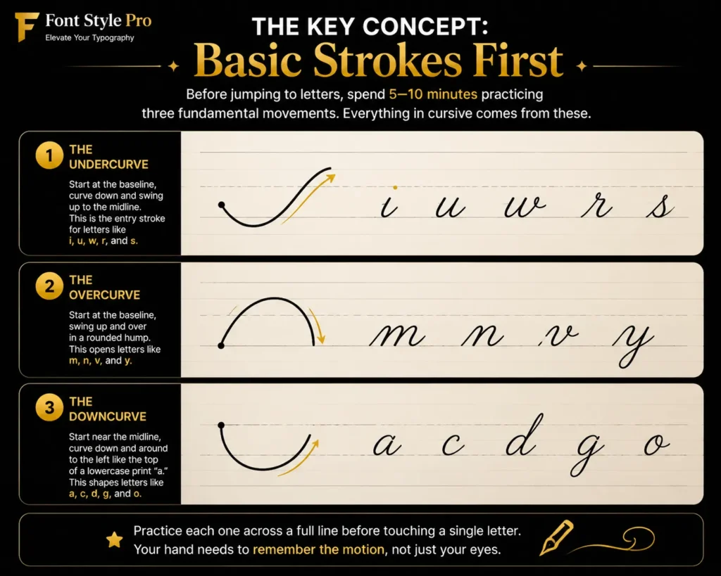
1. The undercurve: Start at the baseline, curve down and swing up to the midline. This is the entry stroke for letters like i, u, w, r, and s.
2. The overcurve: Start at the baseline, swing up and over in a rounded hump. This opens letters like m, n, v, and y.
3. The downcurve: Start near the midline, curve down and around to the left like the top of a lowercase print “a.” This shapes letters like a, c, d, g, and o.
Practice each one across a full line before touching a single letter. Your hand needs to remember the motion, not just your eyes.
How to Write in Cursive: Lowercase Letters A–Z
This is the core of how to write in cursive for beginners. Knowing how to write the letters of the alphabet in cursive is the foundation everything else builds on. Cursive letters are easiest to learn in stroke groups, not alphabetically. Learning “a, b, c, d” in order is actually the hard way because the letters use completely different motions. Grouped by stroke, each letter reinforces the one before it.
Group 1: Undercurve letters (start from the baseline, swing up)
These are the best starting letters because the undercurve is the foundation of most cursive writing.
i: Start at the baseline, curve up to the midline, come straight back down to the baseline, and swing up again. Add a dot above.
u: An undercurve followed by a second undercurve. Think of two connected scoops sitting on the baseline.
w: Three undercurves in a row. Once you’ve got u, w is just one more scoop added on.
t: Undercurve up to the top line, come back down to the baseline. Cross it with a horizontal stroke at the midline after you’ve finished the word.
r: To write an r in cursive, start with an undercurve to the midline, then make two small humps that look like print “n” but smaller and connected. It’s one of the letters that looks least like its printed version.
s: To write an s in cursive, start with an undercurve to the midline, curve back around to form a small oval that closes at the baseline.
j: To write a j in cursive, start with an undercurve down past the baseline into a loop that hooks to the left, then swing back up. Add a dot above the letter body.
p: Undercurve to the midline, then push down past the baseline, loop back up, and retrace to the midline.
Group 2: Downcurve letters (start with a curve going down and left)
a: Start near the midline, make an oval going counterclockwise, then come down to the baseline and swing the exit stroke up.
c: A simple downcurve that doesn’t close. Start near the midline, curve down and stop just above the baseline.
d: Same oval as “a” but instead of swinging up at the baseline, push up all the way to the top line, come back down, and exit along the baseline.
g: Same oval as “a,” then push past the baseline into a downward loop that hooks left. Exit the loop back up to the baseline.
o: A closed oval. Start at the midline, curve counterclockwise, close the oval near where you started, then exit with a small uptick to the right.
q: Like “g” but the loop hooks right instead of left.
Group 3: Overcurve letters (the hump letters)
n: Start with an undercurve, then form two humps using overcurves. Swing out at the baseline.
m: Same as “n” but with three humps instead of two.
v: An undercurve down to the baseline, then a sharp overcurve back up to the midline.
y: Like “v” but the second stroke continues down past the baseline into a loop, then hooks back up.
x: Tricky. Two crossing strokes. Start with an undercurve, cross it with a slanted downcurve going the other direction.
z: To write a z in cursive, start with an undercurve to the midline, make a small flat stroke to the right, then angle down sharply to the baseline, and loop into an exit stroke.
Group 4: Loop letters (letters with loops above or below the baseline)
l: Undercurve from the baseline all the way to the top line, loop back to the left, come down to the baseline, and swing out.
b: Same tall stroke as “l,” but at the bottom, retrace upward partway and make a small rounded bump to complete the letter.
h: To write an h in cursive, make a tall loop like “l,” then from the midline add one hump (like “n”).
k: Tall loop like “l,” then from the midline make a small loop to the right and a forward stroke at the baseline.
f: The lowercase f in cursive is the trickiest of the loop letters. It has a loop above and a loop below the baseline. Start above the midline, loop to the left, come down through the baseline into a bottom loop, then cross horizontally at the midline. The double loop is what trips most beginners up.
e: Start between the baseline and midline, make a small horizontal stroke, loop counterclockwise, and exit.
How to Write Capital Cursive Letters
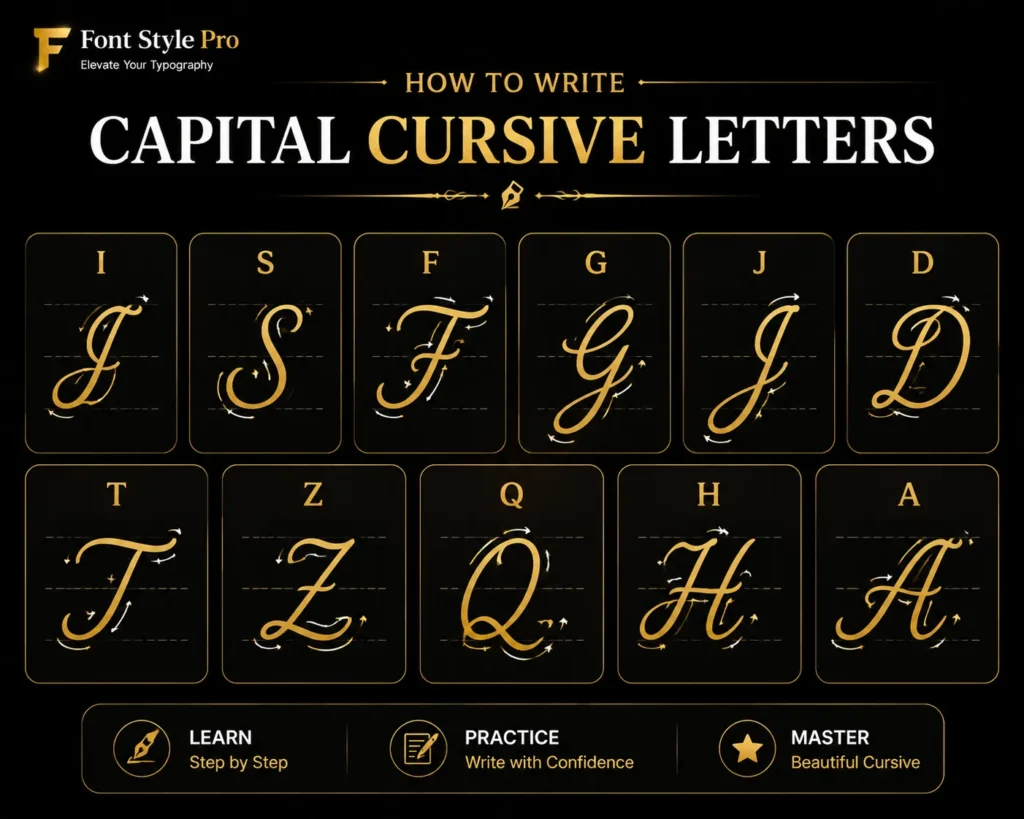
Capital letters follow different rules from lowercase. Most of them stand alone and don’t connect to the letter that follows. A few do connect smoothly. Here are the capitals people search for most.
Capital I in Cursive (Uppercase I)
Capital I, also searched as uppercase I in cursive, is one of the most searched and most confusing letters. In standard American cursive, it’s not a simple straight line. Start above the baseline with a small swoop to the left, then bring a curved downstroke to the baseline, and add a decorative entry and exit curve. It ends up looking like a stylized script letter, not a printed “I.”
Capital S in Cursive (Uppercase S)
Capital S, or uppercase S in cursive, is elegant once you see the motion. Start with a small backward curve from near the midline, then sweep down and around in a large curve to the baseline. It looks like an ornate printed S with flowing entry and exit strokes.
Capital F in Cursive
Capital F has an upper and lower component. Start at the top with a backward curve to the left, come down to the baseline, loop back up, and cross twice: once at the top and once at the midline. It’s one of the more complex capitals.
Capital G in Cursive
Start with a large, open curve that sweeps counterclockwise from near the top line, comes down to the baseline, and curves back. Then add a small horizontal line into the center. Looks like a generous, open oval with an interior cross stroke.
Capital J in Cursive
A tall downstroke from the top line, curving down through the baseline into a wide hook to the left. Then add a small curve at the top as a starting flourish.
Capital D in Cursive
Start at the baseline with a small entry curve, push up to the top line, loop back, and sweep all the way down and around in a wide oval back to the baseline. It’s a big, round letter.
Capital T in Cursive (Uppercase T)
A tall center downstroke from the top, with a long sweeping crossbar at the top that curves from left to right. The crossbar is the signature of a cursive uppercase T, and it’s what makes it look so different from a printed T.
Capital Z in Cursive
A horizontal stroke at the top, a slanted downstroke to the baseline, a horizontal stroke at the bottom, and a small loop exit. Looks like a squared-off figure with a loop.
Capital Q in Cursive
Looks like a cursive 2 at large size. A downstroke that curves around into a tail.
Capital H in Cursive
Two tall loops connected at the midline by a horizontal bridge stroke.
Capital A in Cursive
A wide, open loop sweeping counterclockwise from the top line, coming down to the baseline, then rising in an exit curve.
How to Connect Letters in Cursive
This is where people get stuck. Individual letters feel manageable. Connecting them into words is the real skill.
The exit stroke of one letter becomes the entry stroke of the next. That’s the whole system. When you finish the letter “a,” you’re already drawing the beginning of “n.” The flow is continuous.
Common letter connections
a + n: The exit curve of “a” flows directly into the undercurve that starts “n.” Don’t lift your pen.
o + u: Exit “o” with a small uptick to the right. That uptick is the beginning of the undercurve of “u.”
c + h: “c” exits with an upswing. Connect it to the tall loop of “h.”
t + h: Write the “t” body, connect to “h,” then go back and add the crossbar to “t.”
i + n: The undercurve of “i” naturally flows into “n.” This is one of the smoothest connections.
A useful tip: write the word first, then go back and add all the dots (i, j) and all the crossbars (t, f). It keeps your pen moving without interruption.
How to Write Your Name in Cursive
Writing your name in cursive, or any name in cursive, is one of the best early practice goals because it’s a word you’ll repeat hundreds of times. Whether you want to write your own name or practice writing a name as a gift or card inscription, here’s how to approach it.
Step 1: Look up each letter in your name individually using a cursive alphabet reference. Note the exit stroke of each letter.
Step 2: Check which letter follows each letter. Does the exit stroke of letter one line up naturally with the entry stroke of letter two? Most lowercase combinations do. Some capitals don’t connect to the following letter.
Step 3: Write the full name slowly, letter by letter, focusing on the connection between each pair. Don’t worry about slant or size yet.
Step 4: Write it five times at slow speed to build the motion sequence in your muscle memory.
Step 5: Gradually speed up while keeping the connections smooth. This is where it starts to feel like a real signature.
For signatures specifically, people often develop a personal shorthand over time, where some letters become stylized. That’s fine. Start with standard cursive, then let your signature evolve naturally.
Common Words to Practice
Once you’ve got the basics, practice with real words. These cover a good range of letters and connections.
Short practice words
| Word | Key connections to watch |
| love | l–o connection, o–v exit |
| mom | Three overcurves in a row |
| and | a–n–d is a classic sequence |
| the | t body, then h, add t crossbar after |
| name | n–a–m–e covers multiple stroke types |
Practice phrases
These are full phrases people actually want to write. They’re excellent practice because they include capitalization, spacing between words, and longer sequences.
“Happy Birthday” Practice each word separately first. “Happy” has a below-baseline loop in the “p” pair and a descending “y.” “Birthday” has a tall “B” capital and the tricky “th” connection.
“Merry Christmas” “Merry” has a capital M followed by the “erry” cluster. “Christmas” includes the tricky “Ch” opening and the “tmas” tail. A proper challenge.
“I love you” Short, common, and good practice. Capital I, space, then “love,” space, then “you” with its below-baseline “y.”
“Thank you” Capital T (with its long crossbar), then “hank” as a continuous sequence. “you” again to close. Writing “thank you” in cursive is great practice specifically because of the capital T and the smooth “th” connection that follows.
“Mom” Three letters, all overcurves. Great for building muscle memory on that particular stroke type.
“Snowflake” A longer word that’s worth practicing. It has the tricky “sn” opening, a midword “w,” and ends with “ake” — a clean a–k–e sequence that flows well in cursive.
How to Write Numbers in Cursive
Numbers in cursive look similar to their print versions, but written with a flowing stroke and slightly stylized.
0: A simple oval. Start at the top, curve counterclockwise, close at the top.
1: A single downstroke with a small entry flourish at the top.
2: Curve counterclockwise from the top, come down, then sweep to the right along the baseline.
3: Two curves stacked, opening to the left.
4: A vertical stroke, a horizontal crossbar, then a downstroke through the middle.
5: Horizontal stroke right, then down, curve to the right, then a straight top.
6: A curved downstroke that loops back to close into a small oval at the bottom.
7: Horizontal stroke, then a diagonal downstroke to the lower left.
8: Two ovals stacked, made in a continuous S-shaped motion.
9: A small oval at the top, then a downstroke through the baseline.
Practice writing your phone number and your date of birth. That gives you real-world repetition of every digit.
Tips for Left-Handed Writers
Everything about cursive technique applies to left-handers except two things: hand position and paper angle.
Paper angle: Rotate your paper clockwise (top angles to the right) instead of counterclockwise. This keeps your wrist from hooking over the line of writing.
Hand position: Write with your hand below the baseline rather than above it. This stops you from smudging the wet ink as your hand moves across what you’ve just written. Use a quick-dry gel pen to reduce smudging further.
Slant: Left-handers often write with a slight backward slant or no slant at all. That’s completely fine. The goal is consistent, readable cursive, not 35-degree-right-slant cursive.
Don’t try to mirror right-handed technique. Work with your natural hand movement.
Common Mistakes (and How to Fix Them)
Inconsistent slant. Letters lean at different angles. Fix: Draw light diagonal guidelines on your practice paper at a consistent angle and practice staying parallel to them.
Letters not connecting. You’re lifting your pen between letters. Fix: Slow down. Concentrate specifically on the moment where one letter ends and the next begins. The exit stroke is the bridge.
Loops closing too tight or too wide. Letters like l, b, h, f, and k look wrong. Fix: Practice just the loop in isolation until it feels automatic, then reintroduce it into the full letter.
Capital I looks like a lowercase l. You’re writing it as a single downstroke. Fix: Look up the standard cursive capital I and notice the decorative curves at top and bottom. Practice it ten times in a row.
Writing too fast too soon. Speed before accuracy locks in bad habits. Fix: Slow down until you can write every letter correctly. Speed comes with repetition, not effort.
Pressing too hard. Heavy pen pressure creates tense, scratchy strokes. Fix: Loosen your grip. Your pen should rest lightly in your hand, controlled by fingers, not gripped by fist.
How Long Does It Take to Learn Cursive?
Realistic expectations matter here. With 15–20 minutes of daily practice:
Week 1–2: You’ll learn all lowercase letters and can write them individually.
Week 3–4: You’ll start connecting letters into short words. Connections still require concentration.
Week 5–6: You can write simple sentences without stopping to think about each letter. Muscle memory is beginning to set.
2–3 months: Your cursive is legible and functional for everyday use.
6 months+: Your cursive has its own character and flows at a natural writing speed.
Most adults and school-age children reach functional cursive within 6–8 weeks of consistent practice. Speed and style keep developing for years.
Want Cursive Text Right Now? (Without a Pen)
If you need cursive text for a social media bio, a digital greeting, a username, or anything you’re typing, you don’t need to hand-write it. Our font style generator converts any text you type into copy-paste cursive using Unicode characters.
Type your name, a phrase, or anything you want. Pick the style you like. Copy it. Paste it anywhere that accepts text, including Instagram, TikTok, Discord, WhatsApp, Twitter, and most messaging apps. It works on iPhone and Android without any app or font installation.
It’s not a replacement for learning the real thing. But if you need cursive text for something digital right now, that’s the fastest way to get it.
Cursive takes patience, but it rewards you. A few weeks of practice produces a skill that lasts a lifetime. Start with the undercurve, work through the letter groups, and write your name before the end of your first session. That small win makes the next practice session easier to show up for.
Frequently Asked Questions
What is the easiest cursive letter to learn first?
The lowercase “u” is widely considered the easiest starting point. It’s just two undercurve strokes sitting on the baseline, and once you have “u” down, the motion transfers directly to “i,” “w,” “n,” and “m.” Most cursive teachers start here for exactly this reason.
What is the hardest cursive letter to write?
Capital letters tend to be the trickiest, particularly capital I, capital Q, and capital Z. Among lowercase letters, “f” causes the most problems because it has both an upper loop and a lower loop that cross at the midline. The lowercase “r” also trips people up because it doesn’t look like a print “r” at all.
Should I learn uppercase or lowercase cursive first?
Learn lowercase first. Lowercase letters appear far more frequently in written words, which means you’ll be able to write real words much sooner. Uppercase letters are also more complex and less consistent between cursive styles, so building lowercase fluency first makes capitals easier to pick up.
How do you write the alphabet in cursive from A to Z?
Start with lowercase grouped by stroke type rather than in alphabetical order. Learn undercurve letters first (i, u, w, t, r, s, j, p), then downcurve letters (a, c, d, g, o, q), then overcurve letters (n, m, v, y), then loop letters (l, b, h, k, f, e). Once lowercase is solid, move to uppercase.
How long does it take to learn cursive writing?
Most people can write legible cursive within 4–6 weeks of 15–20 minutes of daily practice. Children learning for the first time typically take 6–12 weeks with structured instruction. Adults relearning often progress faster because they already have fine motor skills from years of handwriting. Developing a personal style and writing at full speed takes longer, usually several months.
Can I learn cursive as an adult?
Absolutely. Adults often learn cursive faster than children because their fine motor skills are already developed and their grip and posture habits are easier to establish. The main challenge for adults is unlearning the impulse to print. Consistent daily practice of even 15 minutes will produce results within a few weeks.
Why do capital letters look so different in cursive?
Capital letters in cursive were designed for visual flair and to stand out at the beginning of words and sentences. Unlike lowercase letters, which are optimized for connection and flow, capitals are more decorative. Styles like D’Nealian, Palmer Method, and Zaner-Bloser each have slightly different capital forms, which is why you might see capital Q or Z written differently depending on where someone learned.
What is the difference between cursive and calligraphy?
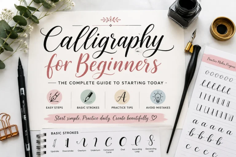
Cursive is everyday joined handwriting designed for speed and practicality. Calligraphy is formal, deliberate pen lettering where thick and thin strokes are carefully controlled, usually with a specialized pen nib. Both are beautiful, but they serve different purposes. This guide covers standard cursive. If you want to explore calligraphy, Spencerian and Copperplate are good starting points.
How do I write my name in cursive?
Look up each letter in your name using a cursive alphabet reference. Write each letter individually, then check the exit stroke of each letter against the entry stroke of the following one. Write the full name slowly, connecting each pair of letters. Practice the whole word 10–15 times at slow speed before increasing your pace. Your signature will develop its own style over time.
Can cursive text be typed or copy-pasted?
Yes. Unicode includes a set of mathematical script characters that look like cursive handwriting. These aren’t fonts you install; they’re built into the Unicode standard that every modern device supports. Tools like fontstylepro.com convert regular text into these characters, which you can then paste into Instagram bios, Discord usernames, WhatsApp, and most text fields.

One Comment