Best Font for Resume: Complete ATS-Safe Guide (2026)
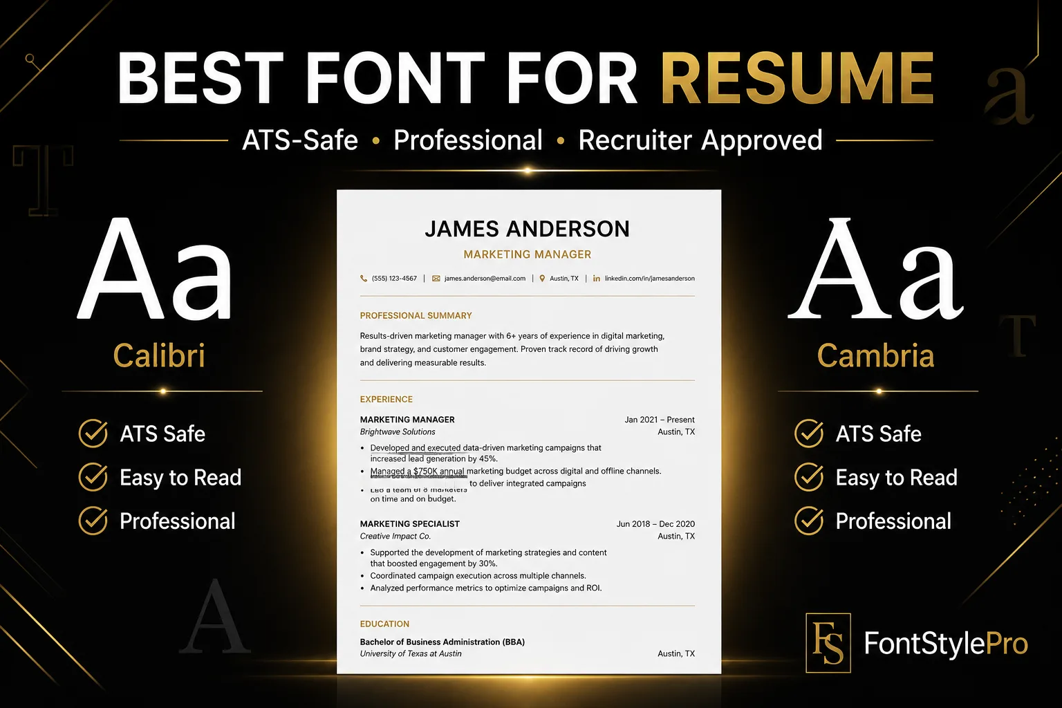
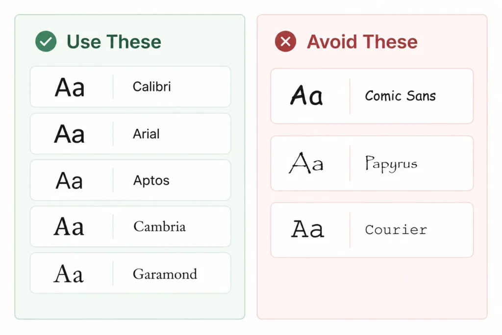
If you’re wondering what is the best font for a resume, the short answer is Calibri, Arial, Cambria, Aptos, or Garamond. They’re clean, they read well on screen and in print, and every applicant tracking system (ATS) parses them without a hiccup. Comic Sans, Papyrus, Brush Script, and Courier are the ones to skip.
That’s the short version of the best font to use for resume writing in 2026. Here’s everything else you actually need to know before you hit save, including font size, formatting, and a few things almost no other guide covers.
Best font for resume 2026: Calibri, Arial, Aptos, Cambria, Garamond, Georgia. Fonts to avoid: Comic Sans, Papyrus, Brush Script, Courier, Impact. Best font size for resume: 10-12pt for body text, 14-18pt for headers, 16-20pt for your name. You can use our resume font generator
Why Font Choice Affects Your Resume
You’ve got about six to eight seconds before a recruiter decides whether to keep reading. That’s not an exaggeration, it’s roughly what hiring studies keep landing on. In that window, a font that’s easy to scan works in your favor, and a font that makes someone squint works against you no matter how good your experience actually is.
There’s a second reader you’re writing for too: the ATS. Most mid-size and large companies run resumes through parsing software before a human ever opens the file. A font that renders as garbled text or gets flagged as an image instead of text can knock you out before the six-second clock even starts.
So font choice isn’t decoration. It’s the difference between your resume getting read and your resume getting skipped, which is exactly why picking the best font for resume writing is worth five minutes of your time.
Serif vs Sans-Serif Fonts
Fonts fall into two broad camps, and understanding the difference is the first step in picking the best font for resume writing.
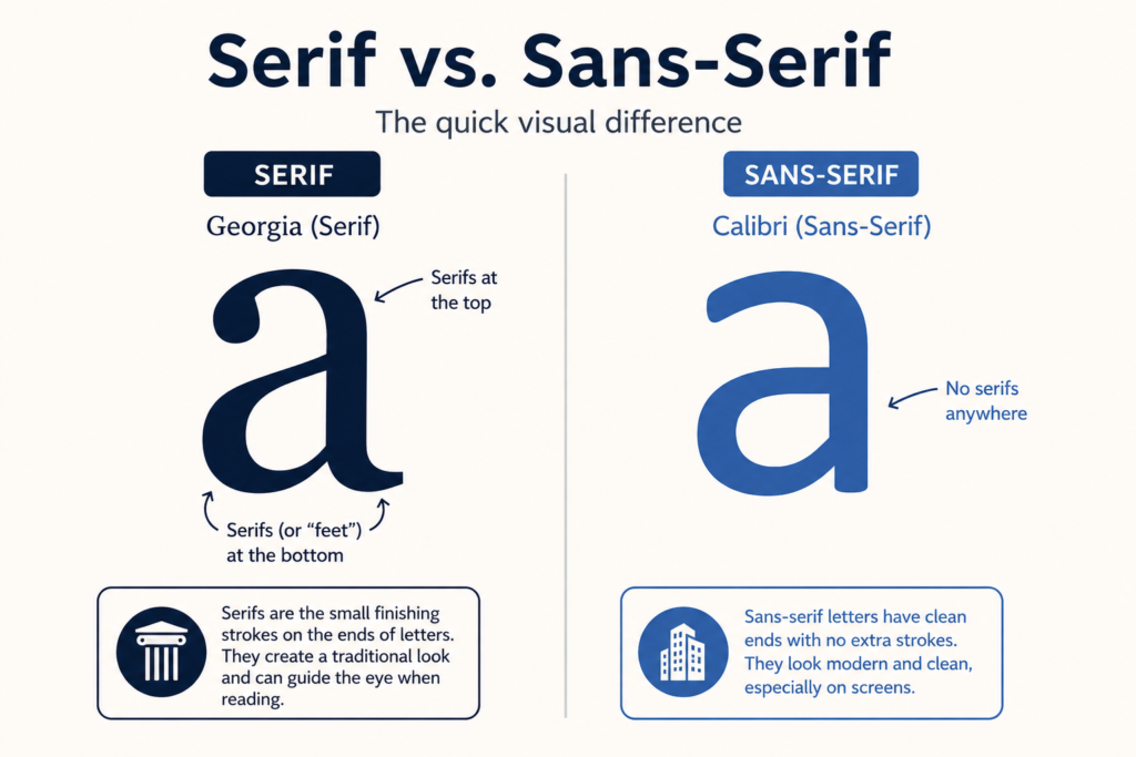
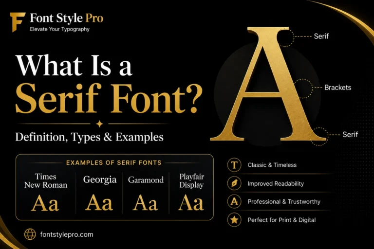
Serif fonts have small tails or feet at the ends of letters (think Times New Roman, Georgia, Cambria, and Garamond). They read as traditional and formal, which is why they show up a lot in law, finance, and academia. If you’re not familiar with how serif typefaces differ from sans-serif designs, read our guide on what is a serif font.
Sans-serif fonts skip the tails and keep the letters plain (Calibri, Arial, Aptos, Helvetica). They look modern and clean, and they’re the default choice for tech, startups, and most general corporate roles. If you’re specifically looking for the best sans serif font for resume writing, Calibri and Arial are the two safest starting points, with Aptos close behind.
Neither style is inherently better for ATS parsing. Both work fine as long as the specific font is a standard one. The real decision comes down to what your industry expects to see.
Best Fonts for a Resume
Here’s the full comparison of the best font for resume use across every major style and industry, so you’re not hunting through paragraphs to find one detail.
| Font | Style | Best For | ATS-Safe | Word | Google Docs | Mac |
| Calibri | Sans-serif | General, corporate | Yes | Yes | Yes | Yes |
| Arial | Sans-serif | Any industry, international | Yes | Yes | Yes | Yes |
| Aptos | Sans-serif | General, modern default | Yes | Yes | Limited | Limited |
| Cambria | Serif | Academic, consulting, management | Yes | Yes | Yes | Yes |
| Garamond | Serif | Law, publishing, traditional fields | Yes | Yes | Yes | Yes |
| Georgia | Serif | Journalism, editorial, law | Yes | Yes | Yes | Yes |
| Times New Roman | Serif | Legal, academic (still debated) | Yes | Yes | Yes | Yes |
| Helvetica | Sans-serif | Creative, design, corporate | Yes | Limited | Limited | Yes |
| Tahoma | Sans-serif | Engineering, technical | Yes | Yes | Yes | Yes |
| Verdana | Sans-serif | Wide readability, international | Yes | Yes | Yes | Yes |
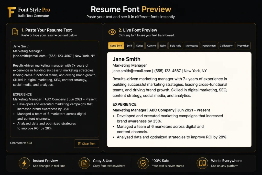
Try It Yourself: Visual Font Comparison Tool
Reading font names in a table only gets you so far. You want to see how your actual resume looks in each one before you commit. Drop your text into the tool below and flip through the fonts live.
Aptos vs Calibri: Word’s New Default
Quick thing most articles haven’t caught up on yet: Microsoft replaced Calibri with Aptos as Word’s default font back in 2023. If you’ve built a resume in Word recently and didn’t manually pick a font, there’s a good chance it’s already in Aptos without you realizing it.
Is that a problem? No. Aptos is just as clean and just as ATS-safe as Calibri, and it was actually designed for better screen readability. The only catch is availability outside Word. If you’re building your resume in Google Docs or an older version of Office, Aptos might not show up, and your file could quietly substitute a different font when someone else opens it. Calibri is still the safer bet if you’re not sure what software the recruiter is using to open your file.
Fonts to Avoid on a Resume
Knowing the best font for resume writing also means knowing what to steer clear of. Some fonts hurt you no matter how strong your resume content is.
- Comic Sans, reads as casual and unserious, and it’s the fastest way to undercut your own credibility
- Papyrus, decorative, cliche, and hard to skim in dense paragraphs
- Brush Script and other handwritten fonts look personal rather than professional, making them difficult to read at small sizes. If you’re interested in learning the real principles behind connected handwriting instead of decorative fonts, check out our guide on how to write in cursive.
- Courier, a monospaced typewriter font that eats up space and looks dated on screen
- Impact and other heavy display fonts, built for headlines, not body text, and they overwhelm a page fast
If a font looks like it belongs on a poster, a birthday card, or a vintage typewriter, it doesn’t belong on your resume.
Why Font Advice Online Contradicts Itself
You’ll notice something if you read more than one resume guide: they don’t agree. Most sites list Arial and Times New Roman as safe, reliable choices. A few call them outdated and tell you to avoid them entirely.
Neither side is wrong. The disagreement comes from different assumptions about what “good” means. If your bar is ATS compatibility and universal readability, Arial and Times New Roman pass easily, they’re about as safe as fonts get. If your bar is standing out visually in a stack of resumes that all look the same, then yes, they’re the two most overused fonts in existence, and that’s a fair critique too.
The real answer: use them if you’re applying somewhere traditional (law, finance, academia, government). Reach for something like Calibri, Aptos, or Cambria if you want a font that’s just as safe but slightly less common.
Best Font by Industry or Role
The best font for resume submissions changes depending on where you’re applying. Here’s how to match it to your field.
Law, Finance, Academia
Stick with serif fonts. Garamond, Cambria, and Times New Roman all signal tradition and credibility, which is exactly the tone these fields expect.
Tech, Marketing, Business
Sans-serif wins here. Calibri, Aptos, and Arial read as modern and efficient without trying too hard.
Creative and Design Roles
You’ve got more room to breathe, but “more room” doesn’t mean “use a script font.” Helvetica or Lato still keep things legible while feeling a little more design-forward than the corporate default.
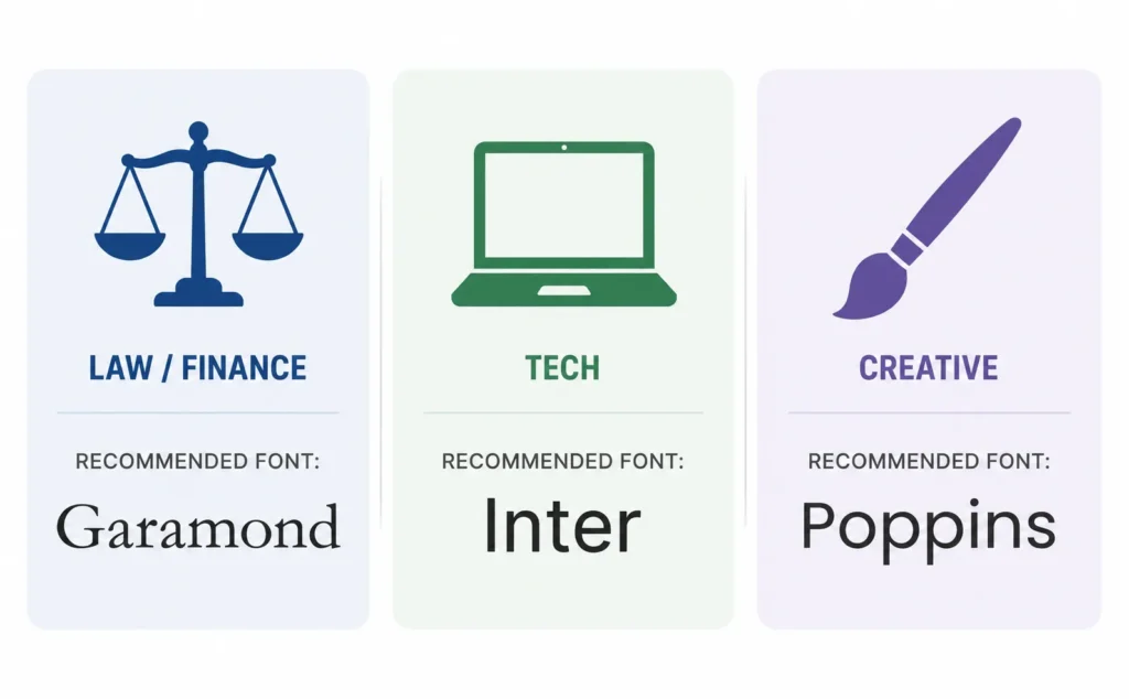
Resume fonts should always prioritize readability and professionalism. If you’re creating content outside of your resume, such as invitations, social media posts, or digital signatures, our Handwriting Font Generator lets you create stylish handwritten text in seconds.
Font Size, Pairing, and Spacing Rules
Picking the best font for resume text is only half the job, size and spacing matter just as much.
Best Font Size for Resume: Name, Headers, and Body Text
- Your name: 16-20pt
- Section headers: 14-18pt
- Body text: 10-12pt
Anything smaller than 10pt strains the eyes. Anything bigger than 12pt for body text starts eating up space you need for content.
Pairing a Heading Font with a Body Font
You don’t have to use one font for the entire resume. A common, safe combination is a slightly bolder font for your name and headers with a simpler font for body text, for example Cambria headers with Calibri body text. Just keep it to two fonts max, and make sure both are on the “safe” list above.
Margins and Color
Keep margins between 0.5 and 1 inch on all sides. Smaller margins risk text getting cut off when printed, larger margins make your resume look sparse. Stick to black text as your default. If you want a small accent, dark gray or navy for headers is about as far as you should push it, anything brighter starts looking unprofessional fast.
How ATS Actually Reads Your Font
Why a Resume Can Fail ATS Even With a Safe Font
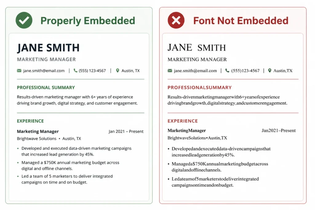
Here’s something most guides skip entirely: you can pick the best font for resume submissions, like Calibri, and still have your resume fail ATS parsing. The usual cause isn’t the font itself, it’s how the file was exported. If a font isn’t embedded properly when you save to PDF, some ATS software substitutes a fallback font, and in the process it can scramble spacing, merge words together, or drop characters. This is more common than people realize, and it’s almost never about font choice, it’s about export settings.
Word vs Google Docs vs PDF: Font Compatibility
This is the part nobody covers, and it matters more than most font advice.
In Microsoft Word, you have the widest font library, including Calibri, Cambria, Garamond, and Aptos natively.
In Google Docs, the font list is different. Calibri, Arial, and Georgia are available and render reliably. Cambria and Garamond are available through Google’s font menu but may look slightly different than the Word version. Aptos isn’t natively available in Google Docs as of now.
When exporting to PDF, always check that fonts are embedded, most modern word processors do this automatically, but it’s worth confirming, especially if you’re using a font that isn’t universally installed. An embedded PDF keeps your formatting locked in place regardless of what software or fonts are on the recruiter’s computer. Without embedding, an uncommon font can quietly get replaced by whatever the viewing device defaults to.
Simple rule: if you’re building your resume in Google Docs, stick to Calibri, Arial, or Georgia to avoid any font-substitution surprises later. That single habit does more for your resume than chasing the best font for resume trends every year.
General Resume Formatting Rules That Affect Font Choice
Your font choice doesn’t work in isolation, it interacts with everything else on the page. A few rules that keep it all ATS-friendly:
- Use a single-column layout, not multi-column or sidebar designs
- Avoid embedding text inside images, logos, or icons, ATS software can’t read those
- Use standard bullet points (round or square), not custom symbols
- Keep date formatting consistent throughout (e.g. “Jan 2023 – Present” everywhere, not mixed styles)
- Spell out job titles and skills instead of relying only on abbreviations
- Save and submit as PDF unless the job posting specifically asks for a different format
Best Resume Fonts for Freshers and ATS in India
The best font for resume applications in India follows the same core rules above, but a few things are worth calling out specifically for this market if you’re applying through Naukri, LinkedIn, or directly to companies like TCS, Infosys, Wipro, or Cognizant.
Indian recruiters and their ATS systems are typically screening hundreds of resumes for a single role, which makes clean parsing even more important than usual. Stick to Calibri, Arial, or Aptos, and pair that with a strict one-page layout if you’re a fresher or have under two years of experience. Skip the photo unless it’s explicitly requested (most product companies and GCCs actively avoid it to reduce bias), and drop decorative section headers with icons or colored backgrounds, they read as visual noise to both ATS parsers and human recruiters who are moving fast through a stack.
The pattern holds across the board: the plainer and more predictable your formatting, the better your resume performs in high-volume screening, which is exactly the environment most freshers in India are applying into.
FAQ
What font does Google Docs recommend for a resume?
Google Docs doesn’t make an official recommendation, but if you’re looking for the best font for resume use inside Docs specifically, Arial, Calibri, and Georgia all render reliably and convert cleanly to PDF, which makes them safe defaults.
Is Times New Roman outdated for resumes in 2026?
It’s not outdated, but opinions are split. Some career sites call it the safest classic choice, others call it generic. It still passes ATS systems fine, so the bigger factor is your industry: it works well in law, academia, and finance, less well in tech or creative fields.
What font size should I use for my name on a resume?
16-20pt works well, noticeably larger than your 10-12pt body text and 14-18pt section headers, so it stands out without looking oversized.
What font is best for resume writing if you’re not sure which industry rule applies?
Calibri or Arial. They’re the two most universally accepted fonts across industries, so when in doubt, that’s the safe default before you narrow down further based on your specific field.
Does font really matter if my resume content is strong?
Content matters more, but a hard-to-read or non-standard font can get your resume misread by ATS or skipped by a recruiter before your content is ever seen, so font choice removes a barrier rather than adding an advantage.
What’s the best font for a resume in Word vs PDF?
The font itself doesn’t need to change, but exporting to PDF with fonts embedded, most word processors do this automatically, prevents your formatting from shifting if the recruiter’s computer doesn’t have that font installed.
Can I use a different font for my name and headings than the body text?
Yes, pairing a slightly bolder or larger font for your name and headers with a simpler font for body text is common and can improve readability, as long as both fonts stay professional and consistent throughout.
What font do recruiters actually prefer?
Surveys vary, but classic, familiar fonts like Calibri, Arial, and Times New Roman consistently come out ahead of decorative or unusual fonts, mainly because they’re fastest to read at a glance.
Is Calibri too generic to use on a resume?
No. Its familiarity is actually an advantage for ATS parsing and quick recruiter scanning, though if you want to stand out slightly, Aptos or Cambria offer a similar clean look with less of a “everyone uses this” feel.
What’s the best resume font for freshers in India?
Calibri, Arial, or Aptos, paired with a strict one-page layout, since Indian ATS systems used by companies like TCS, Infosys, and Wipro prioritize clean parsing over creative formatting.
What’s the best resume font for engineering or IT resumes?
Calibri, Arial, or Cambria all work well, since technical resumes are often text-and-bullet heavy and benefit from a font that stays legible at smaller sizes.
Getting the Rest of Your Resume Right
Once you’ve settled on the best font for resume content and formatting, that part of the job is done, keep it simple, keep it ATS-safe, move on. But if you’re also building out a LinkedIn headline, a personal portfolio site, or a resume header for a page outside the actual ATS document, that’s a place where a little personality in your name or title styling can work in your favor. That’s a different use case than the resume file itself, but if you want to try it, our resume generator tool can help you style just that piece.
One Comment