Tattoo Font Generator: Free Cursive, Old English, Script & More (2026)
Choosing your tattoo design takes minutes. Choosing the wrong font can last a lifetime.
Most people spend weeks picking the quote or name, then rush the lettering in the artist’s chair. That one decision affects how your tattoo reads in five years, how it ages in ten, and whether a stranger can understand it at all. This free tattoo font generator exists to remove that guesswork. Type your text, preview dozens of styles side by side, and walk into your studio session with a clear decision already made.
Below, you’ll find everything that belongs in a complete font decision: style breakdowns, placement rules, aging science, and answers to every question Google tells us tattoo seekers actually search for.
Try our Font Style Generator to instantly convert ordinary text into stylish fonts you can copy and paste anywhere.
What Is a Tattoo Font Generator?
A tattoo font generator is an online tool that renders your typed text (a name, date, word, or phrase) across multiple tattoo lettering styles simultaneously. Instead of opening Photoshop, installing font packs, or relying on your artist’s limited preview sheets, you see your exact words in each style before any needle touches skin.
The best font generator for tattoos does three things well: it shows a realistic preview, it covers all major style categories, and it lets you copy or download the result to bring to your artist. Our tool does all three, for free, with no account required.
The 8 Core Tattoo Font Styles : When Each One Works
Not all tattoo fonts age the same way. Not all of them suit every placement. This section breaks down each major category with the specificity that most competitor guides skip.
1. Cursive & Script Tattoo Fonts
Cursive tattoo fonts are the most requested style on our generator, and for good reason. The flowing, connected letterforms feel personal. They look like a letter written by someone who loved you, not a printed label.
Best for: Names, short quotes, memorial tattoos, fine-line wrist and collarbone pieces.
Aging reality: This is where honesty matters. Fine cursive scripts with thin lines fade faster than bold styles. Strokes under 1mm can blur into each other within 5–10 years, especially in sun-exposed areas. If you want cursive that lasts, ask your artist to slightly thicken the hairlines or go slightly larger than you think you need.
Popular variations in our cursive tattoo font generator: classic italic script, flourish script, connected handwriting, and bold romantic cursive.
Placement tip: Cursive reads best horizontally. On curved surfaces like ribs or forearms, the natural body contour mimics a gentle baseline, which actually complements script fonts beautifully.
Use the cursive tattoo generator font to type your text and compare how tight versus loose letter-spacing changes the entire mood of the same word.
2. Old English Tattoo Font Generator
Old English, also called blackletter or Gothic text, originated in 12th-century European manuscripts. In tattoo culture it carries weight: strength, permanence, tradition, and a certain no-explanation-needed confidence.
Best for: Single words, initials, short names, chest pieces, memorial dates.
Aging reality: Bold strokes hold ink extremely well. Old English is one of the most durable tattoo font styles for long-term legibility, provided the artist doesn’t cram too many letters into a small space. The thick-to-thin stroke variation creates negative space that tends to fill in over decades. Leave room.
Critical mistake to avoid: Old English is frequently chosen for long phrases. Do not do this. More than 5–6 letters in classic blackletter becomes illegible at normal viewing distance. The style was built for single words and short names.
Style variations in our old English tattoo font generator: traditional blackletter, angular Gothic, rounded blackletter, and Old English with decorative swashes.
When you use the old English font tattoo generator on our tool, toggle between the angular and rounded variations. They carry very different energy even though the underlying letterforms are the same.
3. Traditional Tattoo Font Generator
Traditional tattoo lettering, sometimes called American traditional, is built from a specific set of rules developed by tattoo artists over the last century. Bold outlines, minimal thin lines, high contrast between stroke widths, and a slight vintage curve to the letterforms.
Best for: Banners, sailor-style designs, statement words, chest and upper arm placements.
Why it ages better than almost anything else: Traditional tattoo fonts were designed specifically for skin. The thick outlines act as a barrier that prevents ink migration. A traditional lettering piece done by a competent artist will look sharp at 30 years in ways that fine-line work simply cannot.
Use with our tool: The traditional tattoo font generator previews the banner-curve effect that artists hand-draw. Use it to confirm letter spacing before going to your consultation.
4. Gothic Tattoo Font Generator
Gothic and Old English are often confused, but they are distinct. Gothic in tattoo culture typically refers to a broader category: darker, more ornamental blackletter with sharper angles, decorative diamond-shaped serifs, and occasionally integrated illustrations like thorns, crosses, or shadows.
Best for: People who want the Old English aesthetic with more visual drama. Works for back pieces, full sleeves, and chest panels where size gives the ornamental details room to breathe.
Sizing minimum: Do not attempt Gothic lettering at small sizes. The ornamental detail that makes it beautiful at chest-piece scale becomes an undifferentiated blob at wrist scale. Our gothic tattoo font generator will show you exactly where this breakdown happens. Test at multiple size settings before deciding.
5. Calligraphy Tattoo Font Generator
Calligraphy and cursive overlap but are not the same. Calligraphy has a more deliberate, formal structure: thick downstrokes, thin upstrokes, and consistent pen-angle discipline. Think copperplate, Spencerian, or modern brush lettering.
Best for: Quotes, meaningful phrases, dedication pieces where the beauty of the letterform is itself part of the message.
The gap competitors miss: Calligraphy heals differently depending on ink saturation. The thick downstrokes hold beautifully. The hairline upstrokes are fragile. They need to be inked slightly heavier than they appear on screen to survive the skin’s texture. Always discuss this with your artist before finalizing calligraphy tattoo font decisions.
Our calligraphy tattoo font generator displays both the formal copperplate style and the looser modern calligraphy, which has a brushed, organic quality.
6. Chicano & Gangster Tattoo Font Generator
Chicano lettering is one of the most culturally specific and technically demanding styles in tattooing. It emerged from Mexican-American communities in Southern California, carrying decades of cultural identity in its distinctive elongated letterforms, ornamental loops, and fine-line elegance.
What makes it different: Chicano script is not simply cursive with decorative flourishes. The letterforms follow specific cultural conventions: certain letter connections, specific loop structures, and a characteristic backward slant in some traditions. Using it without understanding this context is worth at least a conversation with an artist who specializes in the style.
Gangster tattoo fonts share some DNA with Chicano lettering but tend toward a heavier, bolder weight with stronger contrast and less ornamental delicacy.
Best for: Names, single words, cultural statements. Both styles are most legible at medium-to-large scale.
Our chicano tattoo font generator and gangster tattoo fonts generator let you compare both on your actual text, a comparison very few competitors offer side by side.
7. Typewriter Tattoo Font Generator7. Typewriter Tattoo Font Generator
Typewriter fonts bring a specific emotional register: literary, nostalgic, analogue in a digital world. The monospaced letterforms with their characteristic ink-pressure variation and slightly imperfect alignment create the impression of text struck onto skin by an old Remington.
Best for: Quotes from books, poetry lines, dates and years, literary references.
Unique legibility advantage: Because typewriter fonts are monospaced (every letter takes equal horizontal space), they scale down more cleanly than proportional scripts. This makes them a strong choice for small placements where other fonts blur.
The finishing detail: As one expert style guide notes, adding a small period at the end of a typewriter-font tattoo phrase creates a sense of finality that amplifies the meaning, like the last sentence of a book. Use our typewriter font tattoo generator to preview this exact effect.
8. Fine Line Tattoo Font Generator
Fine line tattooing is the fastest-growing style in the industry. Ultra-thin lines, minimal shading, and a delicate aesthetic that looks like a pencil sketch permanently rendered in skin.
The honest conversation most tools avoid: Fine line tattoo fonts are the hardest style to maintain over time. They are also among the most beautiful when fresh. Lines under 0.5mm spread in the dermis. A fine-line tattoo that is stunning at one year can be significantly blurrier at five years. This is not a reason to avoid the style. It is a reason to choose an artist with documented healed-piece photos, not just fresh-work photos.
Best for: Small, delicate placements: behind the ear, inner wrist, collarbone, ankle.
How to Use the Tattoo Font Generator: Step by Step
Step 1: Type your exact text
Enter the word, name, phrase, or date exactly as you want it tattooed, including capitalization, punctuation, and spacing. Capitalization changes the feel of a font dramatically. “forever” in lowercase cursive carries a different emotional weight than “FOREVER” in the same style.
Step 2: Preview all styles simultaneously
Resist the urge to decide immediately. Scroll through every category. Styles you assumed you wouldn’t like frequently surprise people when they see their actual text rendered in them rather than a generic sample word.
Step 3: Adjust size
Most tools default to a display size that doesn’t reflect real-world tattoo scale. If you’re getting a wrist tattoo, the font should be previewed at approximately 5–8cm. A back piece could be 30cm+ across. Size reveals legibility problems that look fine at default preview scale.
Step 4: Copy and paste your tattoo font
Once you’ve narrowed to 2–3 options, use the copy and paste function to save your text in each style. Send these to your artist before the appointment, not on the day of. Good artists appreciate seeing your direction in advance. It lets them refine, not start from scratch.
Step 5: Download for reference
Save the image file of your preferred style. Print it at the actual size you want the tattoo. Hold it against the placement area in a mirror. This is the single most useful pre-appointment step that most people skip.
Generating Fonts for Name Tattoos
Name tattoos are the most personal use case for any tattoo font generator, and the most technically demanding. When a stranger reads your tattoo, they’re reading a name they’ve never seen, which means legibility carries more weight than for common words..
The critical name-specific rules:
Kerning matters more for names. Generic font previews use balanced sample words. Your name may have problematic letter combinations: “rn” reading as “m”, “fi” ligatures that blur, “ij” pairs that crowd. Always preview your specific name, not just the style.
Consider the name’s length. Short names (3–4 letters) in elaborate calligraphy look stunning. Long names (8+ letters) in the same style become unreadable. Longer names benefit from cleaner, more open letterforms.
Roman numeral name tattoos and date tattoos deserve specific attention. The tattoo font generator roman numerals preview in our tool renders your date in traditional serif numerals, the style that reads most clearly at any scale. For names paired with dates, preview them together rather than separately.
The “let them” tattoo trend: If you’re here looking for the “let them” tattoo fonts generator options. This phrase works in flowing cursive, fine-line script, and bold traditional lettering. Preview all three in our tool to see how the emotional register shifts between styles.
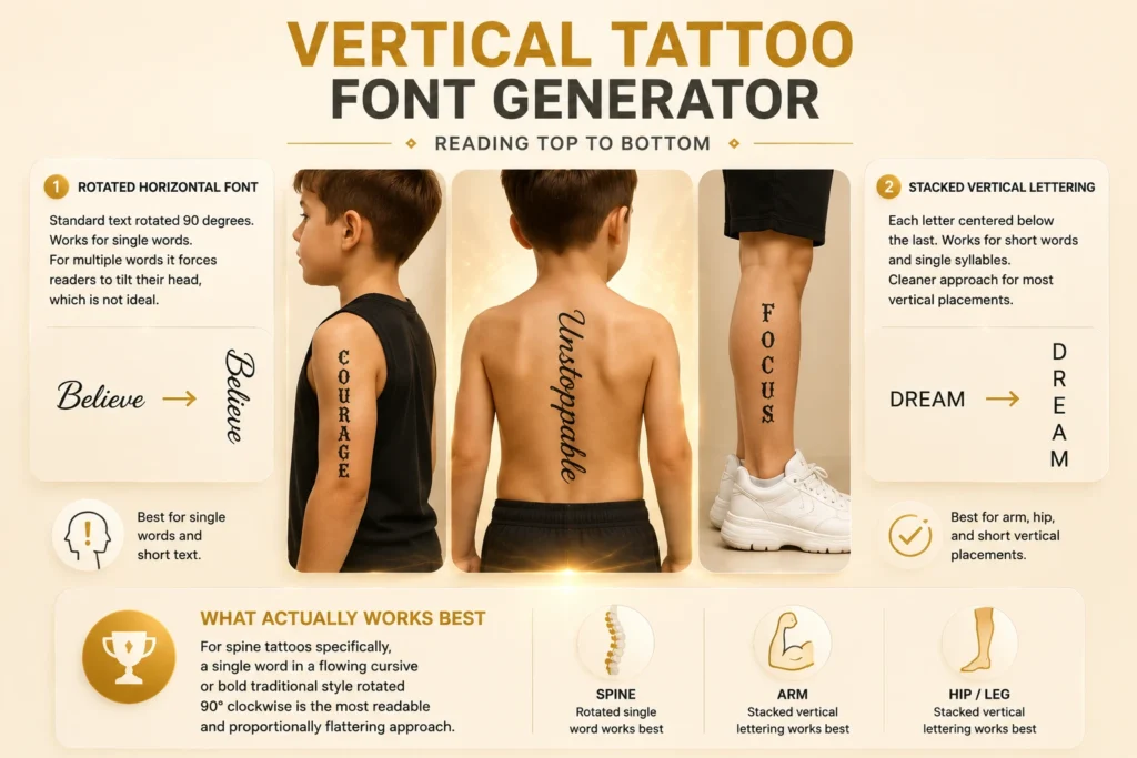
Vertical Tattoo Font Generator : Reading Top to Bottom
Vertical tattoo fonts are an underserved category. Almost every competitor’s guide ignores them. Most people who search for a vertical font generator for tattoos are planning spine tattoos, side-of-arm placements, or hip-to-knee arrangements, all of which require different thinking than horizontal text.
The two approaches to vertical tattoo text:
Rotated horizontal font: Standard text rotated 90 degrees. This works for single words. For multiple words it forces readers to tilt their head dramatically, which is not ideal.
Stacked vertical lettering: Each letter centered below the last. Works for short words and single syllables. In our vertical tattoo font generator preview, this is the stacked mode. It’s the cleaner approach for most vertical placements.
What actually works best: For spine tattoos specifically, a single word in a flowing cursive or bold traditional style rotated 90° clockwise is the most readable and proportionally flattering approach. Stacked lettering works better for arm and hip placements where the body’s natural alignment matches the vertical read.
Font Size and Placement: The Rules Tattoo Artists Use
Most font generator tools show you style. Almost none explain sizing. This is one of the most significant gaps in competitor content.
The minimum size rule by style:
| Style | Absolute minimum (recommended) | Why |
| Fine line script | 1.5cm letter height | Hairlines below this fill in within 2–3 years |
| Cursive / handwriting | 1cm letter height | Connections between letters need space |
| Calligraphy | 1.5cm letter height | Hairline upstrokes need room |
| Old English / Gothic | 2cm letter height | The ornamental detail requires space |
| Traditional / bold | 0.8cm letter height | Thick strokes hold at smaller scale |
| Typewriter | 0.7cm letter height | Monospace holds definition at small sizes |
| Sans serif minimalist | 0.5cm letter height | Clean geometry survives smallest |
Placement-specific considerations:
Ribs: The skin moves dramatically with breathing. Any font with extremely thin strokes will be inconsistent. The needle pressure varies as the chest expands and contracts. Bold styles are more forgiving here.
Fingers: Ink migrates faster on fingers than anywhere else on the body. Fine line and thin script rarely last more than 2–3 years without significant touch-up. If you want a finger tattoo to hold, choose a bold typeface with thick strokes.
Inner forearm: Excellent canvas for almost any style. Good lighting, relatively stable skin, and the natural arm position means people actually read it. Best placement for longer quotes.
Spine: Vertical placement as covered above. Symmetry matters. Slight misalignment is highly visible on the spine. Preview carefully in our vertical tattoo font generator and discuss stencil placement meticulously with your artist.
Collarbone: Horizontal text follows the bone’s natural curve. Cursive and script fonts complement this curve. Rigid, geometric fonts can look awkward because they conflict with the natural baseline.
How Tattoo Fonts Age: What No One Tells You Until After
Skin is a living surface. It moves, stretches, ages, and is damaged by sun exposure. Every tattoo font will look different at year ten than at week two. Understanding this changes your decision.
The aging hierarchy (most to least durable):
Sun exposure is the single largest accelerant of tattoo aging. UV light breaks down ink pigment. Black ink is the most stable; it fades to a softer blue-black over decades. A tattoo on the inner wrist (low sun exposure) will look sharper at year ten than the same tattoo on the outer forearm of someone who doesn’t use SPF.
Weight changes affect placement zones differently. The inner forearm and collarbone are relatively stable. The torso, upper arms, and thighs see more change with significant weight fluctuation. Script fonts with tight kerning in these areas can become crowded or distorted.
AI Tattoo Font Generator: How It Differs From Standard Generators
Standard tattoo font generators render your text in existing font files. The output is predictable. What you preview is exactly what you get.
AI tattoo font generators work differently. Instead of selecting from preset typefaces, AI interprets a style prompt and generates custom lettering that doesn’t exist as a font file. The result can be genuinely unique, but it is also less predictable and sometimes produces letterforms that look great digitally but are extremely difficult to tattoo (hairlines that are too fine to needle, connections that are structurally ambiguous, or style inconsistencies between letters).
When AI generation adds value:
When standard font generation is better:
Our tool gives you both options, which is the combination that actually serves the full range of user needs.
The Questions Tattoo Artists Actually Hear Before Every Font Appointment
After analyzing competitor FAQ sections, we found the same five recycled questions on every page. Here are the questions real clients bring to real consultations:
“Should my name tattoo be in cursive or print?” Cursive feels more personal and emotional. Print (especially serif or sans serif) feels more permanent and deliberate. For a name you’re getting because it means everything to you, the emotional register of cursive is usually right. For a name paired with a date, like a memorial tattoo, mixing cursive lettering with serif numerals is a classic combination that has held up across decades of tattoo tradition.
“Will my artist change my font?” Yes, often. And this is good. Experienced artists modify fonts for skin compatibility. They thicken hairlines, adjust kerning for specific placement areas, and add subtle weight to ensure the piece heals correctly. Bring your font generator reference as a direction, not a rigid specification.
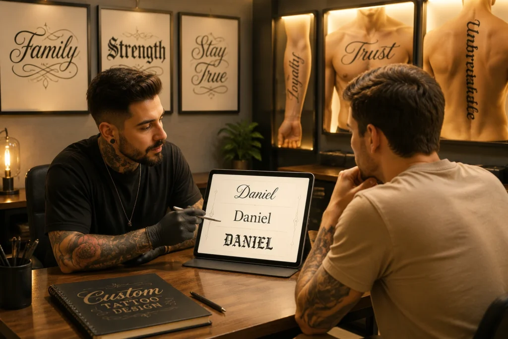
“How many fonts should I bring to my consultation?” Two or three. More than that wastes your consultation time. Use our tattoo font generator to narrow your choices at home, then bring your shortlist to the artist.
“Can I combine two fonts in one tattoo?” Yes, but this requires more skill to execute well than a single-font piece. The most common successful combination is a bold Old English or traditional style for a primary word with a lighter cursive beneath it. This is the approach used in countless chest and back pieces. Our font style guide section above covers which combinations work.
“Is it offensive to get a font style from another culture?” This is a real question that deserves a direct answer, not a deflection. Chicano lettering carries specific cultural origin and meaning. Using it thoughtfully, especially if you have a connection to that community or are working with an artist from that tradition, is very different from using it as pure aesthetic. Gothic and Old English fonts have no such cultural sensitivity concern. Traditional American tattoo lettering is an open style. Calligraphy has multiple cultural origins (European and East Asian), and context matters.
Roman Numeral Tattoo Font Generator: Dates and Numbers Done Right
Roman numeral tattoos are one of the most enduring choices in the category. A birthdate, anniversary, or meaningful year rendered in a system of notation that itself signals permanence.
The font pairing that works: Roman numerals suit serif fonts almost universally. The crossbar strokes on I, the curves on C and D, and the angles on V, X, L, and M all benefit from the contrast between thick and thin strokes that serif typography provides. Our tattoo font generator roman numerals preview shows your date in both traditional serif and modern geometric styles.
The sizing issue with Roman numerals: A date like MCMXCIX (1999) has nine characters. At the sizes that look clean on a forearm, nine Old English characters become illegible. Consider breaking multi-character dates onto two lines, or simplifying to the year only.
Pairing with names: The most effective name-plus-date tattoos use different weights: a flowing cursive name above, cleaner serif Roman numerals below. Preview both together in our tool before your consultation.
Graffiti Tattoo Font Generator
Graffiti lettering in tattoo culture is distinct from wildstyle street graffiti. Tattoo-appropriate graffiti fonts retain the energy of urban lettering: the bubble shapes, the shadow layering, the aggressive angles, but are legible enough to read without the visual puzzle-solving that hardcore wildstyle requires.
Best for: Statement words, single-word tattoos, people who want urban-culture aesthetics in permanent form.
Sizing requirement: Graffiti tattoo fonts need scale. The thick outlines, drop shadows, and letter fills that make graffiti fonts interesting require at least 3–4cm of letter height to read. Do not attempt graffiti lettering at small sizes.
The style question to ask your artist: Can they do 3D shadow work in the lettering? The depth-of-field effect created by strategic shading transforms a graffiti font from flat to genuinely dynamic. This is an artist-skill question, not a font-generator question. It belongs in your consultation.
From Generator to Studio: Making the Most of Your Reference
A font generator is a starting point, not a final design. Here’s how to carry your preview into a productive artist consultation:
Bring the reference printed at actual size. This is non-negotiable. What looks bold on a phone screen at standard display size can look different printed at 10cm on paper held against your arm. Most home printers can do this. Bring the print, not just a screenshot.
Know your placement before the appointment. Your artist cannot accurately advise on font size and weight without knowing where it’s going. Skin thickness, texture, and movement are all placement-specific.
Ask to see healed photos. Any artist you’re trusting with lettering should have documented photos of their lettering work healed, not just fresh. Fresh tattoos look sharper than they will at six weeks. Healed work is the truth.
Don’t compromise on size to “keep it subtle.” Small text tattoos are the most common source of lettering regret. The tattoo that feels too bold at the consultation is the one you’ll still be proud of at year fifteen. The one that felt perfectly delicate often becomes illegible at year five.
Trust the artist’s technical modifications. If they say they need to thicken a hairline or adjust the kerning, they are protecting your tattoo, not ignoring your reference. The best artists use your font generator preview as creative direction, not a binding specification.
Looking for stylish social media text? Try our Instagram Bio Font Generator to create eye-catching Instagram bios, profile names, captions, and aesthetic text styles that help your profile stand out.