What Is a Serif Font? Definition, Examples, and When to Use One
A serif font is any typeface that has small decorative strokes (called serifs) attached to the ends of its letterforms. Look at a capital “I” in Times New Roman: those little horizontal bars at the top and bottom? Those are serifs. A font without them (like Arial or Helvetica) is called a sans serif font.
A serif font is a typeface with small finishing strokes at the ends of each letter. Serifs originated in ancient Roman stone carvings and have been a typographic standard since the printing press era. They’re most common in print media (books, newspapers, academic papers) because the serifs help guide the eye along lines of text.
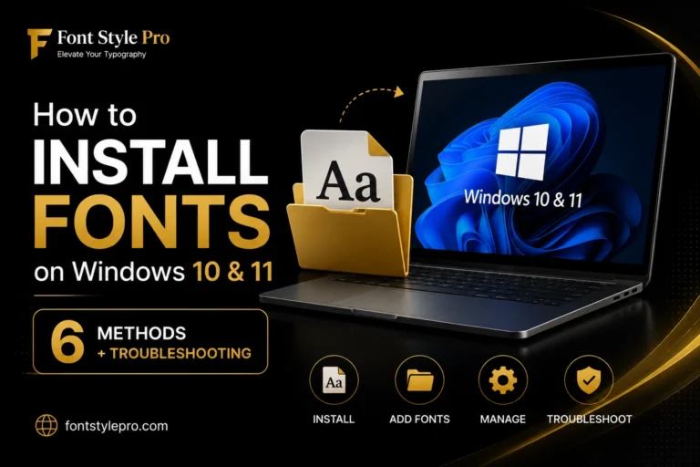
After selecting the perfect serif font, you’ll need to install it on your device. Learn how to install fonts on Windows 10 and Windows 11 with our easy step-by-step guide.
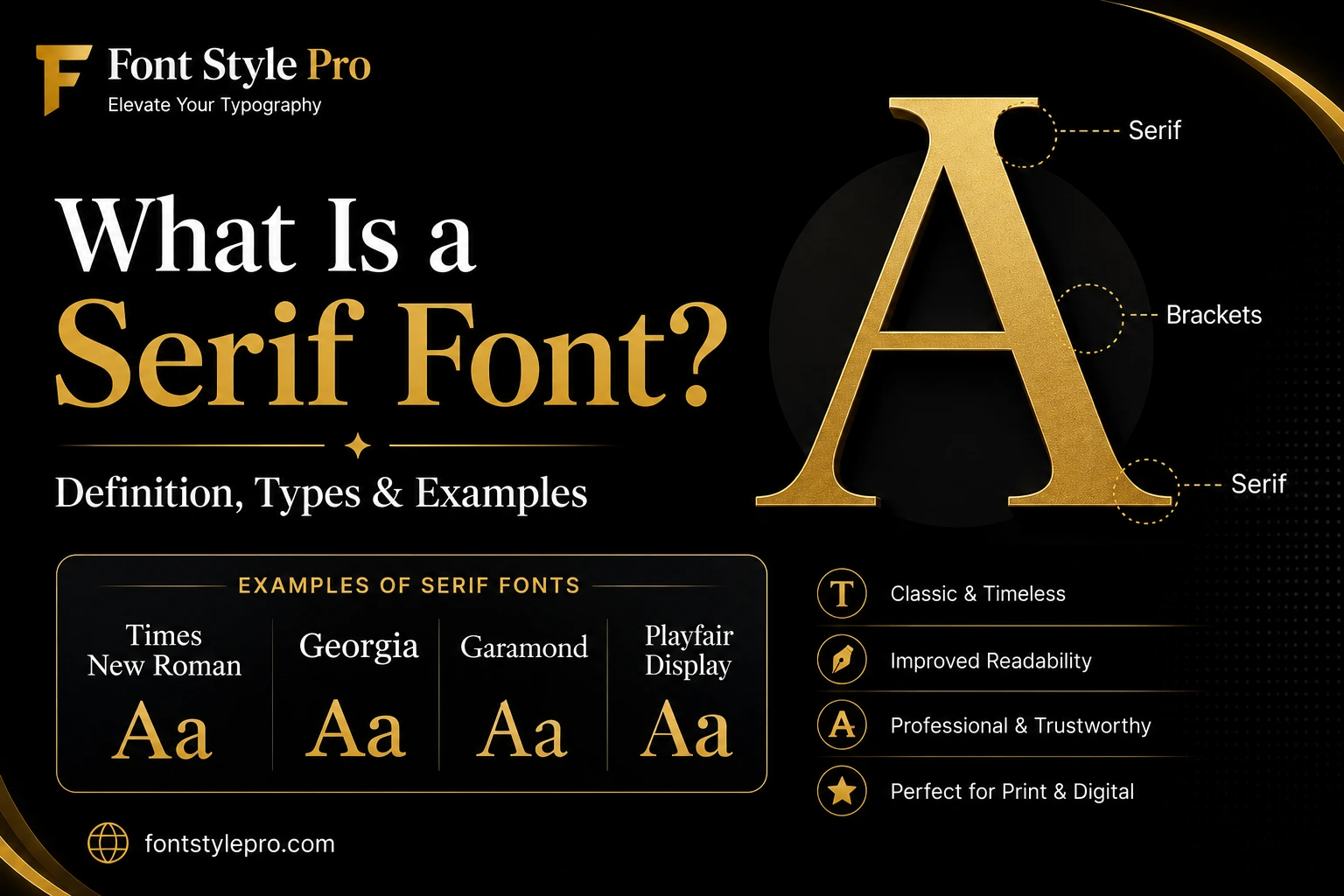
The Anatomy of a Serif (What You’re Actually Looking At)
Before getting into types and examples, it helps to know what the individual parts are: because “serif” refers to a very specific thing on the letter, not the whole font.
Here’s what to look for on any serif letterform:
- Stroke: the main body of the letter (the vertical bar of a “T,” for example)
- Serif: the small horizontal or angled flick at the end of a stroke
- Bracket: the curved transition connecting the serif to the main stroke (present in most but not all serif styles)
- Terminal: the endpoint of any stroke that doesn’t end in a serif
The presence or absence of a bracket is actually what separates the main subtypes of serif fonts. Soft brackets = old style. No bracket, hairline serif = modern. Thick slab = no bracket at all.
The 4 Main Types of Serif Fonts
Not all serif fonts look the same. They’ve evolved over 500+ years, and the differences between them are significant for design purposes.
Old Style (Humanist)
The oldest category: typefaces like Garamond, Caslon, and Palatino. They mimic the strokes of a calligrapher’s pen, so you’ll notice diagonal stress (the thickest part of the “O” is at an angle) and subtle contrast between thick and thin strokes. They’re warm, classic, and highly readable at body-text sizes. Great for books and editorial.
Transitional
This is the middle era: fonts like Times New Roman, Baskerville, and Georgia. More upright, sharper contrast, more refined brackets. Times New Roman is the most recognized serif font in the world and the default in Microsoft Word for decades. It’s a transitional serif.
Modern (Didone)
Fonts like Bodoni and Didot. High drama: extreme contrast between hairline-thin and very thick strokes, flat serifs with no bracketing. Beautiful at large display sizes, rough at small body text. You’ll see these in luxury fashion branding, magazine covers, and high-end editorial.
Slab Serif (Egyptian)
What Is a Slab Serif Font?
A slab serif font has thick, blocky, rectangular serifs with little to no bracketing. Think Rockwell, Clarendon, Courier, or Merriweather.
They’re bold, assertive, and designed to hold up at large sizes or on rough print surfaces. That’s why you saw them on 19th-century posters and why they still work well for headlines, logos, and display contexts.
Slab serifs are also popular in digital UI where you want a serif feel without the fragility of thin strokes: Merriweather, for instance, was designed specifically for screen readability.
Serif Font Examples (With What They’re Actually Good For)
Here are the most common serif fonts you’ll encounter, and where they actually belong:
| Font | Type | Best Used For |
| Times New Roman | Transitional | Academic papers, formal documents |
| Georgia | Transitional | Web body text, blogs |
| Garamond | Old Style | Book interiors, long-form print |
| Palatino | Old Style | Editorial, literary publishing |
| Baskerville | Transitional | Branding, book covers |
| Bodoni | Modern | Fashion, luxury, magazine headlines |
| Didot | Modern | High-end editorial, display |
| Rockwell | Slab | Logos, headlines, posters |
| Merriweather | Slab | Web body text, news sites |
| Courier | Slab (Monospace) | Code samples, typewriter aesthetic |
| Playfair Display | Transitional/Modern | Blog headings, lifestyle sites |
Serif vs. Sans Serif: The Actual Difference
“Sans” is French for “without.” A sans serif font has no finishing strokes: letters end clean and flat. That’s the whole difference.
| Serif | Sans Serif | |
| Has decorative strokes? | Yes | No |
| Common examples | Times New Roman, Georgia, Garamond | Arial, Helvetica, Open Sans |
| Typical use | Print, books, newspapers, formal docs | Web, mobile UI, signage |
| Perceived feel | Traditional, authoritative, elegant | Modern, clean, minimal |
| Screen readability | Good at large sizes, can struggle small | Generally better at small sizes |
| Print readability | Excellent: serifs guide the eye | Good, but serif often preferred |
The “serif fonts are easier to read in print” rule holds up well.
The serifs create a visual baseline that helps your eye track along a line of text: especially useful in dense columns like a newspaper. On screens, especially at small sizes, clean sans serif fonts often render more clearly, which is why most mobile UI defaults to them.
That said, this isn’t a hard rule. Georgia was designed specifically for screen reading and performs extremely well. Merriweather was built for web body text. A good serif font in the right size and context is perfectly readable on any device.
Not sure whether a font is serif or sans serif? You can use our tool to identify fonts from images and discover the exact typeface in seconds.
Is Times New Roman a Serif Font?
Yes, Times New Roman is a serif font. It’s a transitional serif, designed in 1931 by Stanley Morison for The Times newspaper in London.
You can see the serifs clearly on every letter: the horizontal bars on the “I,” the pointed terminals on the “r”: and it has moderate contrast between thick and thin strokes, which is characteristic of the transitional category.
It’s probably the most recognized serif font in the world, which is partly why it’s become associated with “default” and “boring.” But it’s technically well-crafted and perfectly legible for its intended purpose: dense text printed at small sizes.
When to Use a Serif Font (and When Not To)
Use a serif font when:
- You’re designing for print: books, magazines, newspapers, brochures. Serifs genuinely improve reading endurance in long-form print.
- You want a formal or authoritative tone: legal documents, academic papers, professional letterheads.
- You’re setting display type at large sizes: a Modern or Slab serif at 60px looks stunning.
- You’re building contrast in a font pairing: pair a serif headline with a sans serif body (or vice versa) for visual interest.
Think twice about a serif font when:
- Body text will be very small on screen (under 14px): thin serifs can become noise
- You’re designing for ADA-compliant signage (regulations typically require sans serif for wayfinding)
- The brand identity is minimalist or tech-forward: a serif may feel mismatched
- You’re designing for low-resolution displays or older devices
How to Tell If a Font Is Serif in 3 Seconds
Not sure whether a font you’re looking at is serif or not? Do this:
- Find a capital “I” in the font
- Look at the top and bottom of the vertical stroke
- If there are horizontal bars or any decorative endings: it’s a serif font. If it’s clean and flat with no extra strokes: it’s sans serif.
That’s it. The capital “I” is the clearest test because it’s a single straight stroke with nowhere to hide.
Want to Use Stylish Serif-Style Fonts Right Now?
You don’t need to install any font to use stylish serif-style text online. FontStylePro generates Unicode text that you can copy and paste directly into Instagram bios, Twitter, Discord, WhatsApp, or any platform that accepts text: no special fonts required.
→ Try the stylish serif text generator on FontStylePro
Frequently Asked Questions
What is a serif font?
A serif font is any typeface that has small decorative strokes: called serifs: at the ends of its letterforms. These finishing strokes trace back to ancient Roman stone-carving, where chisels naturally left tapered endings on letters. Common examples include Times New Roman, Georgia, Garamond, and Baskerville.
What are examples of serif fonts?
The most widely used serif fonts are Times New Roman, Georgia, Garamond, Baskerville, Palatino, Bodoni, Didot, Rockwell, and Merriweather. Each belongs to one of four categories: Old Style, Transitional, Modern (Didone), or Slab Serif. Times New Roman and Georgia are the most common in everyday documents and web content.
What is a sans serif font?
A sans serif font is a typeface with no decorative strokes at the ends of its letters. “Sans” means “without” in French. Common examples include Arial, Helvetica, Open Sans, Roboto, and Futura. Sans serif fonts are popular in digital and mobile design because their clean letter shapes tend to render well at small sizes on screen.
Are serif fonts easier to read?
In print and long-form reading, yes: research generally supports that serif fonts improve reading endurance because the serifs help the eye track along lines of text. On screens, particularly at small sizes, the advantage is less clear. Well-designed screen serifs like Georgia and Merriweather read just as well as sans serif fonts. The font’s design quality matters more than the serif/sans serif category alone.
What’s the difference between serif and sans serif fonts?
Serif fonts have small decorative strokes at the ends of letters; sans serif fonts don’t. Serifs tend to feel traditional, formal, and elegant: they’re the go-to for books, newspapers, and academic work. Sans serif fonts look cleaner and more modern, which is why most digital interfaces use them. Both are widely used in design and neither is universally “better”: it depends on the context.