Italic Text Generator: Copy and Paste Italic Text for Instagram, LinkedIn, and More
Type your text into an italic text generator and it instantly swaps your normal letters for Unicode characters that look slanted everywhere, even on apps like Instagram and Discord that don’t let you press Ctrl+I. You copy the result and paste it anywhere text boxes accept plain text. No app, no login, no font installation.
That’s the short version. Here’s everything else you actually need to know before you paste it somewhere it won’t work right.
An italic text generator converts regular letters into special Unicode characters from the Mathematical Alphanumeric Symbols block that render as italic on any platform, because they’re technically a different set of characters, not a formatting style. This works on Instagram, Twitter/X, Discord, and Facebook. It does not work on numbers, punctuation, or non-Latin scripts like Arabic or Chinese, and it’s a poor fit for LinkedIn and WhatsApp for reasons we’ll get into below.
You can also try our font style generator for more advanced text styling options and variations.
Why Ctrl+I Doesn’t Work on Instagram or Discord
Here’s the part almost nobody explains clearly. When you hit Ctrl+I in Word or Google Docs, you’re not changing the letters. You’re applying a style tag that tells the document “render this in italic.” The letter A is still the letter A behind the scenes.
Social media text boxes don’t support style tags. They only accept plain text, so there’s nothing for Ctrl+I to attach to. An italic text generator gets around this by swapping the letter A for a completely different character, 𝐴, that happens to look italic. Your device doesn’t apply a style. It just displays whatever character you pasted, and that character is permanently slanted no matter where it goes.
This is also why italic Unicode text survives copy-paste between apps. It’s not formatting that can get stripped. It’s just text.
How to Use an Italic Text Generator
That’s the whole process. No formatting menu, no export, nothing to download.
Serif Italic vs. Sans-Serif Italic: Which One Should You Use
Most generators dump out one italic style and call it done. There are actually two distinct looks, and picking the right one matters more than people realize.
Serif italic (𝐼𝑡𝑎𝑙𝑖𝑐) has the little feet and flourishes you’d see in a printed book or newspaper. It reads as classic, literary, formal.
Sans-serif italic (𝘐𝘵𝘢𝘭𝘪𝘤) is cleaner and more geometric, closer to what you’d see in a modern app interface.
| Use case | Better choice | Why |
| Book or movie title in a caption | Serif italic | Matches traditional print convention for titles |
| Instagram or TikTok bio | Sans-serif italic | Looks native to the platform’s modern UI |
| Citation or quote | Serif italic | Signals “formal reference” the way print does |
| Username or display name | Sans-serif italic | Cleaner at small sizes |
| Aesthetic or moodboard captions | Either, by feel | Pick whichever matches your page’s existing style |
If you’re italicizing a book title, a film title, or a foreign-language phrase, like you would in academic writing, serif is the closer match to convention. For bios, captions, and casual social posts, sans-serif tends to look more at home.
Bold Italic Text: When to Combine the Two
Bold italic (𝙄𝙩𝙖𝙡𝙞𝙘) stacks two emphasis signals at once. Use it sparingly, the same way you’d use all-caps. It’s good for:
Bold italic on a full sentence is harder to read than either style alone, especially on small phone screens. Save it for two to five words, not paragraphs.
How Long Should Italic Text Be?
This is the one rule nobody puts in writing, and it’s the most practical tip in this article: italic Unicode text works great for short phrases and gets genuinely hard to read past a sentence or two.
The Mathematical Alphanumeric Symbols block wasn’t designed for body text. It was built for math notation. At one to eight words, your eyes adjust fine. Stretch it across a full paragraph and the slant starts to fight your brain’s normal letter recognition, especially at smaller font sizes on mobile.
Use italic Unicode for bios, single-line captions, usernames, and short callouts. For anything longer, like a multi-sentence Instagram caption, stick to regular text and let italic do its job as an accent, not the whole outfit.
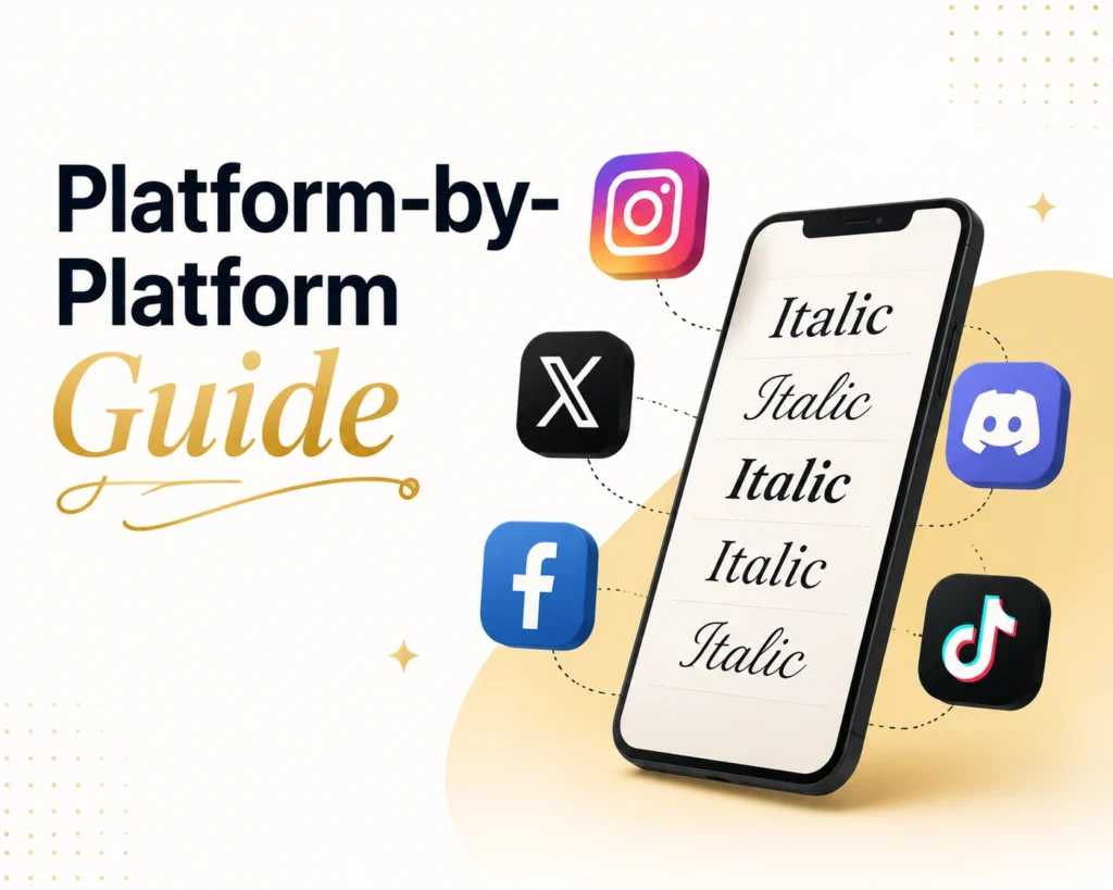
Platform-by-Platform Guide
This is where most italic text generator pages stop short. They tell you it “works on social media” and leave you to figure out the rest. Here’s what actually happens on each platform.
Works perfectly in your bio, captions, and Stories text. Paste it directly into any text field. One catch: Instagram’s bio character limit (150 characters) counts each Unicode character the same as a regular letter, so length isn’t an issue, just keep an eye on readability at small sizes. Visit our Instagram bio font style generator
Twitter/X
Works in your display name, bio, and tweets. Italic Unicode is genuinely useful here since X has no native italic formatting at all. Sans-serif italic tends to match X’s interface style best for display names.
Works in posts, your bio, and comments. Facebook renders Unicode reliably across both desktop and mobile apps, so this is one of the safest places to use it.
Discord
Works in usernames, server descriptions, and messages, but here’s the thing: Discord already has native italic. Type *text* or _text_ and Discord renders true italic formatting automatically. Use the Unicode generator only when you want italic in places Discord’s native markdown doesn’t reach, like a server name or a nickname. Learn about discord text formatting.
TikTok
Works in your bio and captions. Bold italic specifically renders well on TikTok’s bio section and tends to stand out in a feed full of plain text.
This is the platform where you should think twice before using an italic text generator, and it’s worth explaining why in full, since virtually no other guide on italic text covers this.
LinkedIn’s search algorithm indexes plain text. Unicode italic characters are technically different characters from the standard alphabet, so LinkedIn’s search doesn’t reliably match them to searches for the normal version of your words. If you italicize your headline or a keyword in your About section hoping to stand out, you may be making yourself harder to find in LinkedIn search, not easier.
There’s also a character-count issue. Some Unicode italic characters take up more space in LinkedIn’s character limit than the visual length suggests, so a post or headline that looks short can quietly eat into your limit faster than plain text would.
And if you’re writing a LinkedIn article rather than a post, you don’t need this tool at all. LinkedIn’s article editor supports real, native rich text formatting, including actual italic, bold, and headers, the same way a word processor does.
Bottom line for LinkedIn: use italic Unicode sparingly, if at all, in headlines or About sections where search visibility matters. Skip it entirely in LinkedIn articles.
Here’s the honest answer: you don’t need an italic text generator for WhatsApp. WhatsApp has native formatting built into its keyboard. Type _your text_ with underscores on either side and WhatsApp converts it to real italic automatically. Asterisks (*text*) give you bold, and tildes (~text~) give you strikethrough.
This works the same way whether you’re texting in English, Hindi, Urdu, or any other language WhatsApp supports, which matters if you’re in a market like India or Pakistan where WhatsApp is the primary messaging app. The Unicode generator still works on WhatsApp if you want a specific aesthetic style instead of standard italic, but for plain italic, the underscore trick is faster and looks completely native.
Gmail and Email
Subject lines display as plain text in most inboxes, so italic Unicode can technically appear there, but rendering is inconsistent across email clients (Outlook, Gmail mobile, and older clients can all handle it differently). For email body text, your email client’s native formatting bar gives you real italic with full accessibility support, which is the better choice.
What an Italic Text Generator Can’t Do
Every competing guide glosses over this. Here’s the full, honest list of limitations, stated plainly:
The Accessibility Problem Nobody Mentions
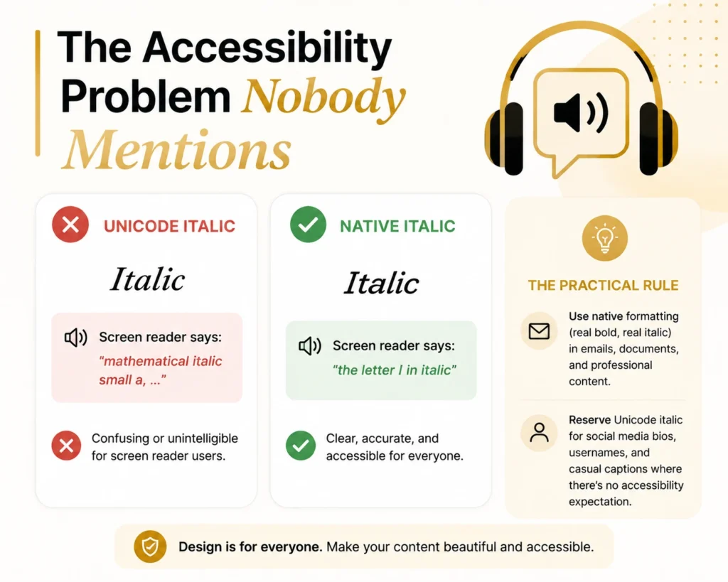
Italic Unicode characters aren’t styled letters. They’re separate characters that happen to look italic, which means screen readers don’t interpret them as “the letter A in italic.” Many screen readers announce them character by character as something like “mathematical italic small a,” which is confusing or unintelligible for anyone relying on audio navigation.
This is fine for a casual Instagram bio. It’s a real problem in places where accessibility matters: official documents, business emails, anything aimed at a broad audience that might include screen reader users. The practical rule: use native formatting (real bold, real italic) in emails, documents, and professional content. Reserve Unicode italic for social media bios, usernames, and casual captions where there’s no accessibility expectation.
Italic vs. Bold vs. Underline: When to Use Each
| Style | Best for | Avoid for |
|---|---|---|
| Italic | Titles, foreign words, subtle emphasis, internal thought in writing | Long passages, anything needing screen reader support |
| Bold | Strong emphasis, headlines, calling out a key word | Full sentences (loses impact, looks like shouting) |
| Underline | Links, single-word emphasis in specific contexts | General emphasis (often confused with a hyperlink) |
| Bold italic | Maximum emphasis in a short phrase | Anything longer than a few words |
In formal writing, italic has specific jobs: titles of books and films, foreign words and phrases, and a character’s internal thoughts in fiction. On social media, the rules loosen, but the instinct should stay the same. Italic signals “pay slightly closer attention here,” not “this is the most important thing on the page.” That’s bold’s job.