Identify Font from Image: Free Online Font Identifier Tool
You spot a typeface on a logo, a poster, a wedding invitation, or an Instagram post and you want to use it. Maybe something close to it. The problem: no file, no source, no name. Just an image with text sitting inside it.
That’s exactly what a font identifier from image solves. Upload the image, get the font name. No design software, no guesswork, no subscription. This guide explains how the identification process works, how to get accurate results from any image type, and how to handle the tricky cases most tools won’t tell you about.
After identifying your font from an image, you can experiment and customize it further using our Font Style Generator to create perfect typography for your projects.
What a Font Identifier from Image Actually Does
When you upload an image to a font identifier, the tool doesn’t read text the way OCR does. It reads shapes. The AI examines individual letterforms and looks at the features that make one typeface distinct from another: the curve of a lowercase a, the leg of an uppercase R, the tail on a Q, the aperture of a c, the stress angle of an o, the presence or absence of serifs, stroke contrast, x-height, and spacing rhythm.
These features are cross-referenced against a font database. The output isn’t a guess. It’s a ranked match based on how many visual characteristics align. That’s why image quality matters more than image size. A small, sharp crop outperforms a large, blurry screenshot every time.
How to Identify a Font from an Image: Step by Step
Step 1: Get the sharpest version of the image you can find
If the text is on a website, take a fresh screenshot at 100% zoom rather than saving a compressed thumbnail. If it’s a printed piece, photograph it in natural daylight, straight-on, without flash. If it’s a social media post, open the original post and screenshot it directly. Saving through WhatsApp or messaging apps compresses and softens edges, which hurts accuracy.
Step 2: Upload the image to the font identifier
Use the upload button or drag and drop. Most tools accept JPG, PNG, and WEBP. The tool starts analyzing the moment the image is loaded.
Step 3: Crop tightly around the text you want identified
This step makes the biggest difference. Don’t submit the whole poster or the full logo. Draw your crop around the specific word or headline. Leave a small margin so strokes aren’t clipped, but cut out icons, background textures, decorative lines, and any text in a different style. The identifier works on one font signal at a time. Mixed signals produce mixed results.
Step 4: Read the results like a typographer, not a checklist
The top result is the highest-confidence match, but look through the top three to five suggestions. Type your own text into the preview if the tool offers that feature. Check that lowercase letters, numbers, and punctuation from the original match the suggested font, not just the capital letters.
Want to make your Instagram bio stand out? Try our Instagram Bio Font Style Generator to create unique and stylish text for your profile.
What Makes a Good Image for Font Identification
Contrast: Dark text on a light background, or light text on a dark background, either works as long as the separation is clear. Avoid mid-tone backgrounds where text edges fade into the background color.
Resolution: The letterforms need enough pixels to preserve fine details. Thin serifs, ink traps, and stroke terminals are what separate similar fonts. If those disappear in a compressed image, the identifier can only match broad characteristics.
Straight orientation: Text needs to be horizontal. Rotated, curved, or perspective-distorted text (like on a bottle or a billboard photographed from an angle) reduces accuracy. Straighten before uploading where possible.
Minimum character count: Two or three letters give limited information. A full word with a mix of round letters (o, c, e), straight letters (l, i), and diagnostic letters (a, g, R, S) gives the AI much more to work with. Five or more characters is the reliable minimum.
One style per crop: If a design uses a bold headline above a light-weight body text, identify them separately. Two styles in one crop confuse the matching process.
Identify Font Name from Image: Reading the Results
The font name returned is the starting point, not always the final answer. Here’s how to evaluate what you get back:
Font family vs. font style: The identifier may return “Futura” when the original is “Futura PT Condensed Bold.” Always check whether the specific weight and width you see in the image is available within that family.
Confidence percentage: A 90%+ confidence result on a clean image is reliable. A 60% confidence result on a compressed social post means you have a strong lead, not a definitive answer. Compare manually.
Similar fonts in the results: If the exact font is a paid typeface you don’t want to license, look at the similar font suggestions. These are visually close alternatives, often available free under open licenses. They won’t be identical but they’ll carry the same typographic voice.
Custom and modified fonts: Many brand logos use a known font as a base that was then customized through adjusted kerning, redrawn letters, added ligatures, or modified terminals. The identifier will return the source font or a close relative. That’s still useful information. You’ve identified the typographic DNA of the logo even if the exact file doesn’t exist commercially.
Identify Font from Image: Use Cases That Need Different Approaches
Logo font identification
Logos are the hardest case. Crop away the icon and isolate only the wordmark text. Run the wordmark through the identifier. If the result feels close but not exact, compare the distinctive letters specifically: the a, g, and R in the brand name. A custom letter in a logo is usually one of these because they have the most visual variety across typefaces.
For small logos or low-resolution brand assets, try to find the same brand’s name on a larger surface. A billboard photo, a high-res press kit image, or an official website header screenshot will all give the identifier more detail to work with.
Screenshot and website font identification
Website screenshots work well because screen rendering produces clean, high-contrast text. Take the screenshot at native display resolution. For Mac users, Retina screenshots are particularly sharp. Crop the heading or UI text and upload. If you can access the webpage directly, browser developer tools will show the CSS font-family value without needing an identifier at all. For flat screenshots where you can’t inspect code, the upload method is the right path.
Poster and print material identification
Print fonts photograph well under even lighting. Avoid photographing under tungsten light, which creates a warm color cast that lowers contrast between text and background. If the poster has a busy background image behind the text, increase image contrast before uploading or crop only the area where the letters have a clean background.
Packaging and product labels
Packaging photography introduces perspective distortion. Hold your phone or camera directly in front of the label, perpendicular to the surface, and crop the flattest, clearest section of text. Curved labels on bottles are particularly difficult. Try photographing from the side where the curvature is least pronounced.
Instagram, social media, and digital graphics
Social platforms recompress images on upload and download. The original graphic almost always produces sharper identification results than a saved copy. Where possible, take a screenshot of the post on screen rather than saving the image to your camera roll. For Instagram Stories specifically, screenshot the story before it’s reposted or shared, since each reshare compresses the image further.
Identify Font Style from Image: Understanding What You’re Looking At
Font identification becomes significantly easier when you understand what the tool is matching. Here are the main categories:
Serif fonts have small strokes at the ends of letterforms. Times New Roman, Georgia, Garamond. Often used in editorial, legal, and academic contexts. Identifying distinguishing features: serif shape (bracketed, slab, hairline), stroke contrast, and the curve of the bowl.
Sans-serif fonts have clean terminals without decorative strokes. Helvetica, Arial, Futura, Gill Sans. Used extensively in UI design, branding, and display contexts. Key identifiers: geometric vs. humanist construction, single-storey vs. double-storey a, the shape of the t crossbar.
Script and cursive fonts simulate handwriting. Identifying these is harder because many are visually similar and custom variants are common. Look at the connection style between letters, the angle of the slant, and whether the ascenders have loops or straight strokes.
Display and decorative fonts are designed for headlines and rarely used at small sizes. These are usually the easiest to identify because their visual distinctiveness means fewer competing fonts in the database.
Monospace fonts give every character identical horizontal width. Common in code editors and typewriter aesthetics. Courier New, Consolas.
Identify Hindi, Marathi, Arabic, Malayalam, and Other Script Fonts from Images
Font identification for non-Latin scripts follows the same logic but requires a tool that has those scripts indexed in its database. Here’s what to look for with Indian language scripts specifically:
Devanagari (Hindi, Marathi): The identifying features are the headline stroke (shirorekha), the curve of the matras (vowel marks), and the thickness ratio between vertical and horizontal strokes. Fonts like Mangal, Kokila, and Noto Sans Devanagari each have distinct stroke weights and headline treatments. Uploading a sharp crop of the shirorekha area produces better results than a full paragraph.
Malayalam: Malayalam letterforms are highly circular. The key distinguishing features are the loop endings and the proportions of the vowel modifiers. High-contrast images work best because many Malayalam fonts have delicate thin strokes.
Arabic: Arabic script connects letters in both cursive and more structured typographic forms. Upload a segment of connected text that includes at least one word with multiple letterforms visible. The identification tool will look at letter connections, dot positioning, and stroke terminals.
For all regional scripts, the principle remains the same: sharp image, tight crop, good contrast, multiple characters visible. The process for how to identify a font from an image in Hindi is identical to identifying a Latin font. Only the database coverage varies by tool.
Font Identifier from Image vs. Photoshop and Adobe Tools
Designers who already work in Adobe software sometimes try to identify fonts through Photoshop or Adobe Fonts. Here’s how those approaches compare to a dedicated font identifier:
Photoshop Match Font (available in Photoshop CC and later) can identify fonts from images opened directly in Photoshop. You select an area of text with the marquee tool, then use Type > Match Font. It works reasonably well for Latin fonts and has improved over recent versions. The limitations are notable though: it only searches Adobe Fonts and a subset of activated fonts, it doesn’t surface free alternatives, and it requires an active Creative Cloud subscription.
Adobe Illustrator does not have a native font-from-image identification feature. Designers sometimes use the Image Trace function to vectorize text and then attempt to match letterforms manually. That process is time-consuming and imprecise.
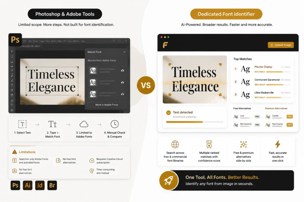
Dedicated font identifiers have a broader search scope because they’re built specifically for this task. They search across free and commercial font libraries simultaneously, return multiple ranked matches, offer similar font suggestions, and work in any browser without requiring software installation. For identifying fonts from images quickly and comparing free alternatives alongside paid fonts, a standalone identifier is the more practical tool for most use cases.
Why the First Result Isn’t Always Right (and What to Do)
Font identification is probabilistic, not absolute. Several situations reliably produce imperfect first results:
Heavily modified brand fonts: The identifier returns the original typeface, but the brand modified several letters. Compare character by character. The source font is still useful as a starting point.
Compressed or low-resolution images: The AI can’t resolve fine details and returns the closest broad category match. Try to source a better image before concluding the result is wrong.
Multiple fonts in one crop: If your crop includes two different weights or styles, the tool averages the signal. Crop to one style.
Rare or newly released fonts: The database may not include fonts released recently or fonts with very limited commercial distribution. In these cases, use the similar font suggestions to find the closest available alternative.
Handwritten or custom lettering: Truly hand-drawn letterforms are not fonts. A font identifier will return the closest-matching typeface, which is useful for finding a similar look but won’t identify the specific pen, brush, or lettering artist.
When the first result feels close but not exact, check the second and third results, look within the same font family for other weights and widths, and compare the specific letters that feel different rather than judging the overall impression.
Frequently Asked Questions
Font identification from an image is a skill that gets faster with practice. The tool does the computational work. Your job is to give it the clearest possible sample to work with. Sharp crop, good contrast, and the right number of characters. Do that consistently and you’ll name almost any font you encounter.